Sections
Dashboard viewingVisualization CreatingShare dashboardHome pageActivity historyDashboard editingBuilderVISUALIZATION CREATING
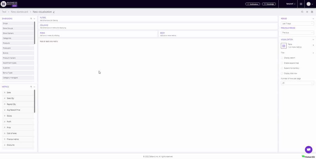
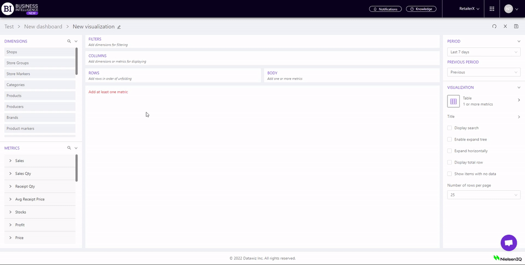
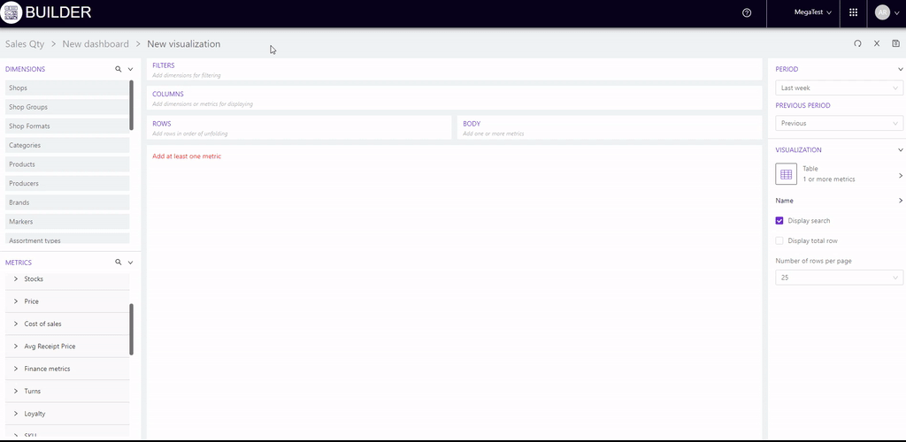
Builder - visualization constructor on Datawiz BI service
Creating a visualization page is designed to generate analysis data and select their further display.
You can go to this page from the Home page.
At the top of the page Creating a visualization the location of the created visualization is displayed:
Dashboard group name → Dashboard name → Visualization name.
To create a new visualization you need:
-
add dimensions and metrics;
-
set the period;
-
adjust the table;
-
if necessary, change the type of visual display.
Adding dimensions and metrics
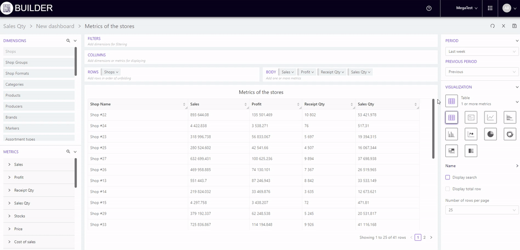
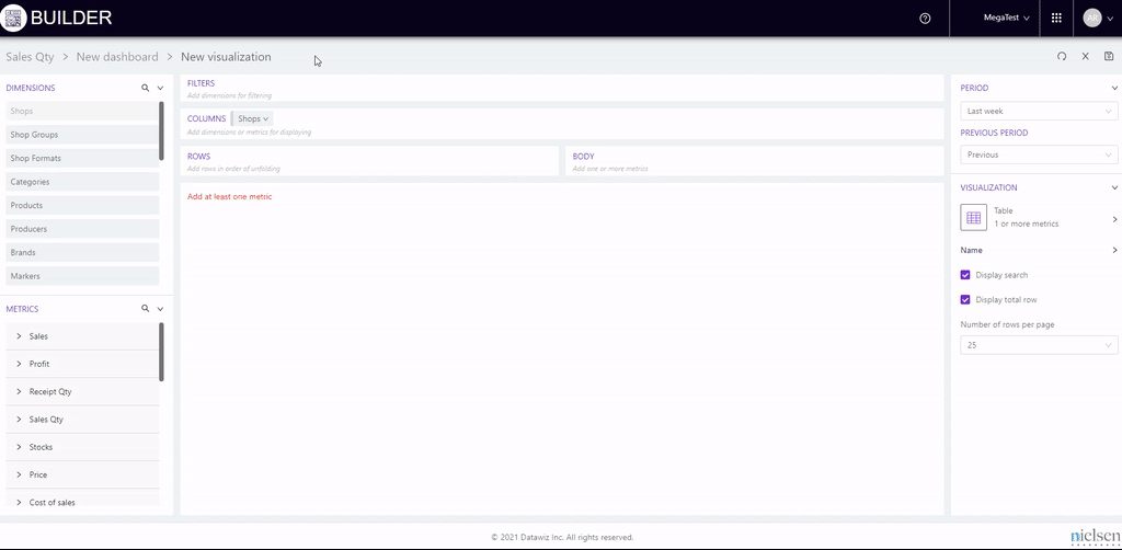
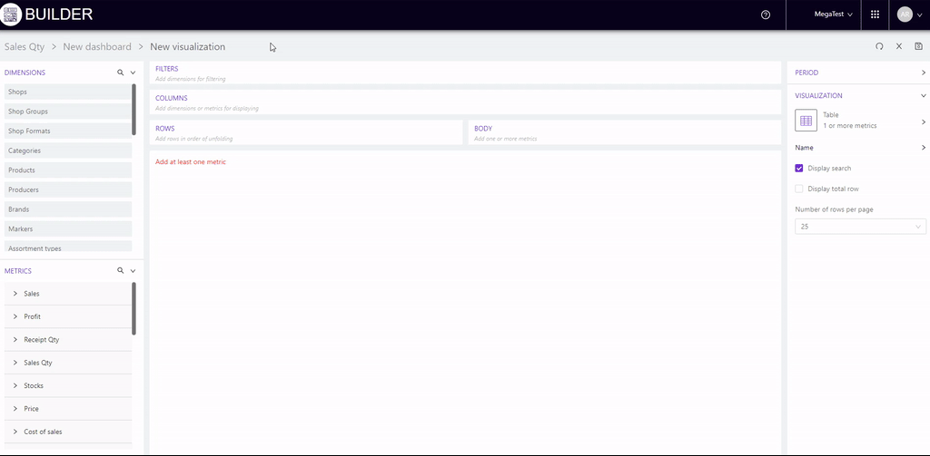
The central part of the page is a conditional "designer screen" of the visualization. Here the user can move all the necessary data for analysis.
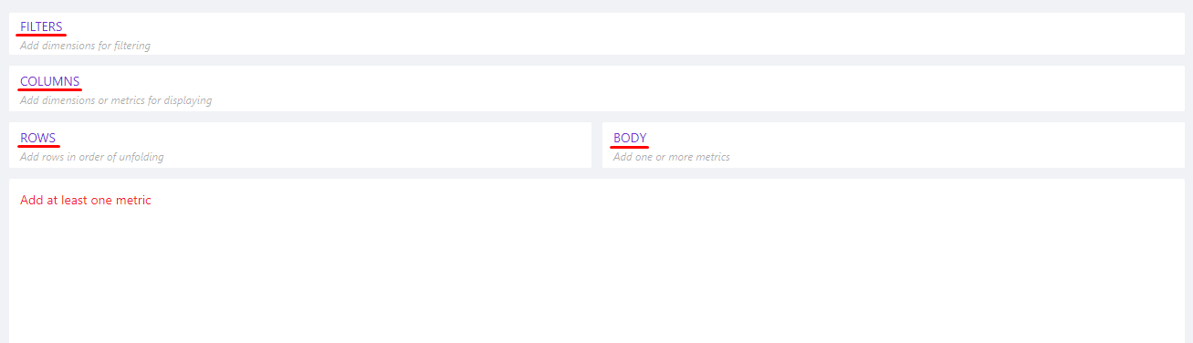
The following blocks are provided for this purpose:
-
Filters - allows to filter the analysis data by selected dimensions.
-
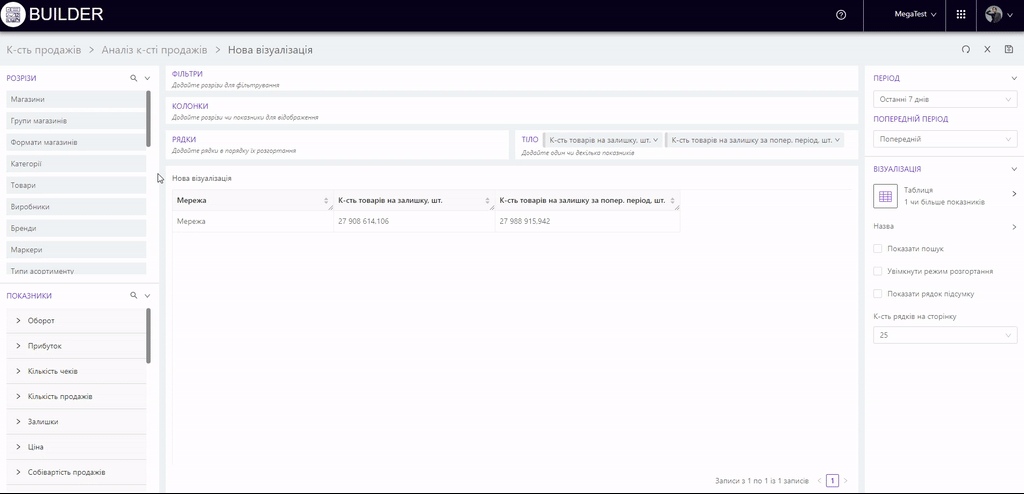
Columns - allows to add dimensions and metrics that will be displayed in the columns of the visualization table.
-
Rows - allows to add dimensions or metrics that will be shown in the rows of the table.
-
Body - allows to add metrics that will be displayed in the body of the table.
On the left side of the page, there are dimensions and metrics from which you need to select the ones you need to build the visualization.
Dimensions - criteria for selection of analysis data presented by the general list: store, categories, products, promotions, types of promotions, brands, category managers, suppliers, receipts marks, cashiers, producers, markers, store formats, store groups, types of bonuses, POS-terminals, clients LP, write-off types, LP client groups, product type, day / month / year, month / year, year, month, week, day of the week, hours.
The search function provides a quick search for the desired dimension.
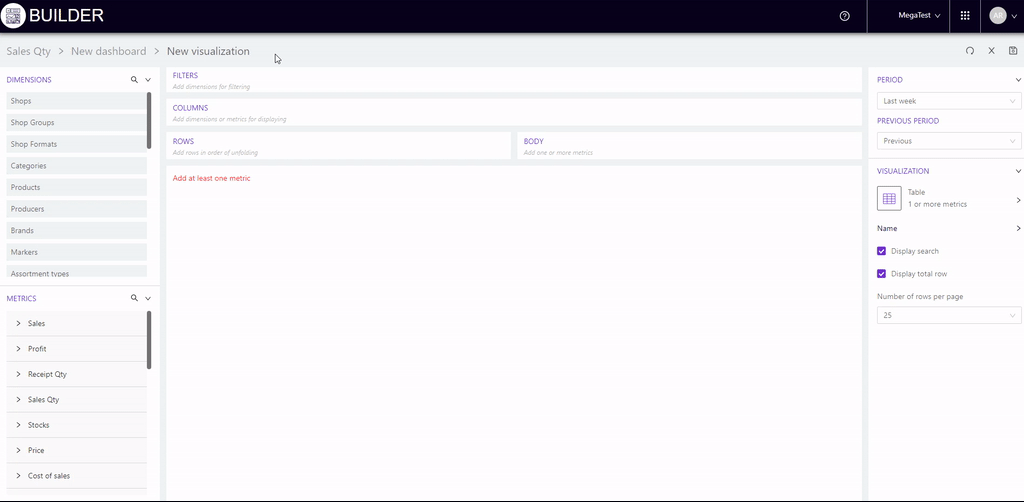
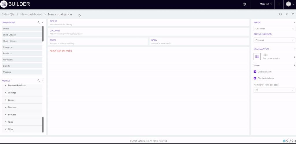
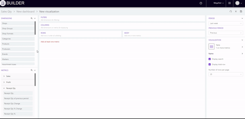
Metrics - organized into groups of metrics available for analysis: sales, sales qty, receipts qty, avg receipt price, price, plans, financial metrics, turns, profit, SKU, return, return to suppliers, order, write-off, bonuses, penetration, stocks, etc.
Each indicator expands to a list of related metrics.
You can use the search function to quickly find the required metric.
Right of the heading "Dimensions" / "Metrics" the list of dimensions/metrics is expanded/collapsed.
This ensures comfortable work with the desired unit while viewing and selecting the desired items.
To add a section for analysis, you must:
Step 1 Drag the section to the desired block (filters, columns, rows). For example, consider the choice of section "Store".
Step 2. A modal window appears where you need to select the desired stores. At the top of the window there is the name of the section under which there are two blocks:
- All - contains a list of stores from which you need to select those stores for which the data will be formed in the visualization table. The search box allows to search for the desired stores by number or name.
- Selected - shows the stores that will be added to the table.
At the top right of each block is a counter showing the number of selected stores.
Step 3. Apply the selected actions to the stores. You can cancel the selected actions.
Adding two or more dimensions
You can place two or more dimensions on the table at the same time.
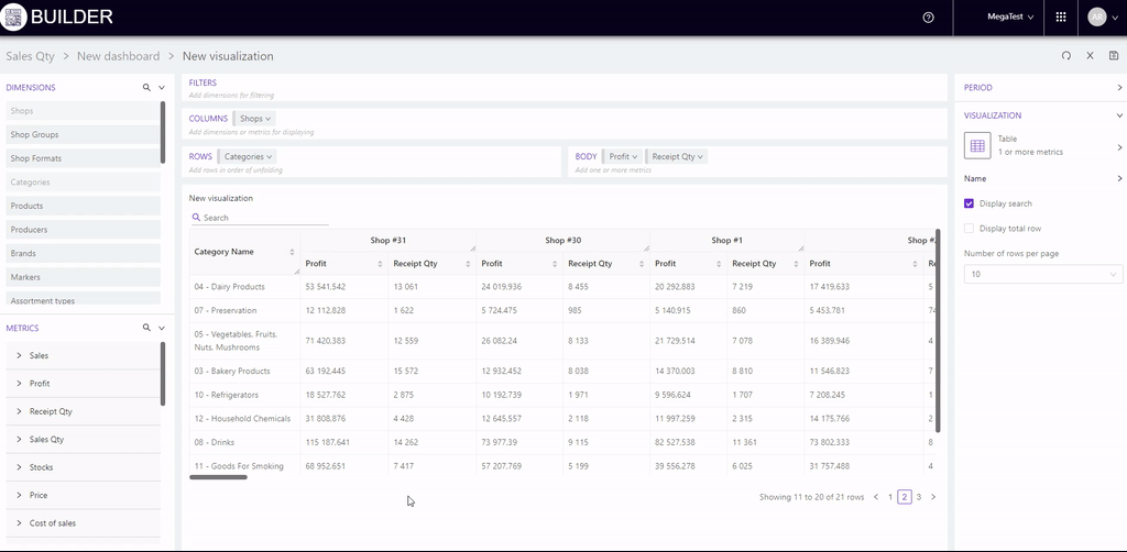
For example, let's choose in addition to the dimension "Stores" also a dimension "Categories". We drag it to the "Rows" block. A list of categories that expand to subcategories appears in the modal window.
To select the desired category, check it with a flag. You can select any number of categories/subcategories.
Expanding of dimensions in the visualization
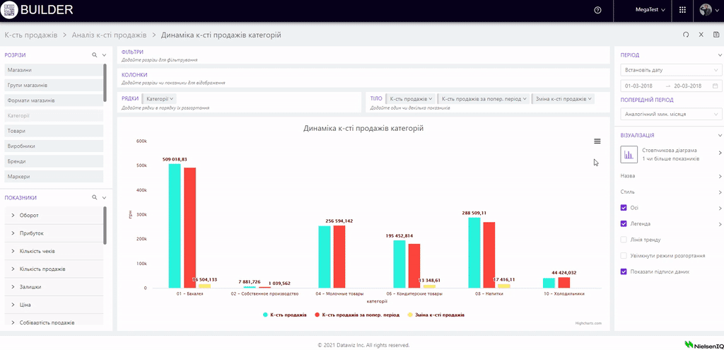
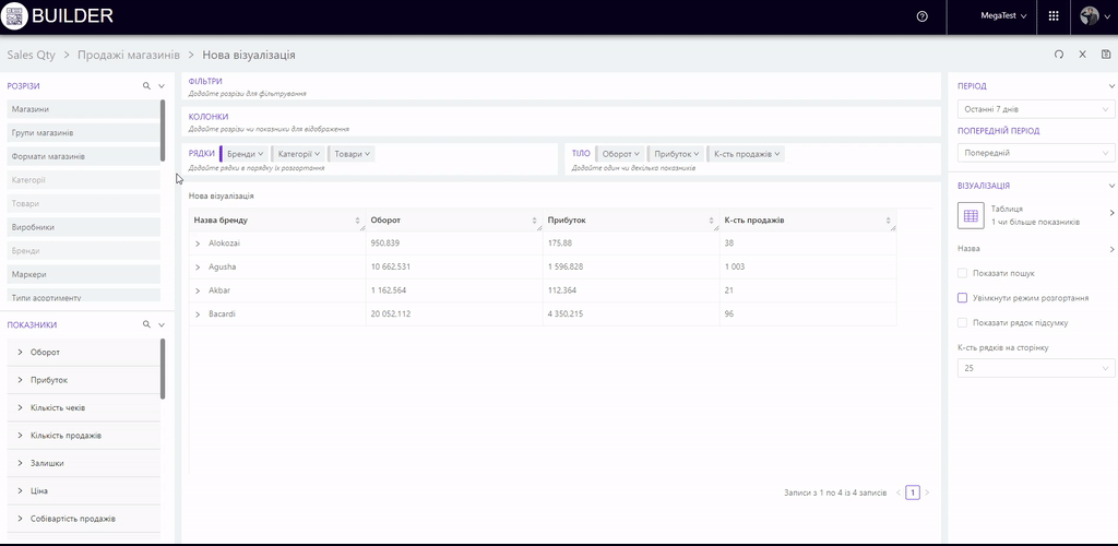
You can add several mutually agreed dimensions to the rows of the table, which will unfold in the desired sequence. For example, choose dimensions: "Brands", "Categories", "Products". In this case, the rows of the visualization table will expand from brands to categories and individual products included in them.
There are two possible ways to display them:
1. The visualization elements will be expanded from brands to categories and directly to the products included in them. That is, the category tree of the "Categories" section will not be taken into account.
2. Brands will be deployed to higher-level categories which will gradually fall to the lowest level of the category tree. The final point of deployment will be products. To do this you need to activate the "Enable deployment mode" checkbox on the right panel.
This checkbox appears when you select the following visualizations: Table, Line graph, Area graph, Bar graph, Bar graph with accumulation, Bar graph, Stacked graph, Combination graph, Fixed bar graph, Bubble graph, Dot graph, Pie graph, Sector graph, Tree graph.
Construction of visualizations in the form of dynamics of metrics
To do this, drag one of the dimensions to the "Rows" or "Columns" block:
-
"Day / Month / Year";
-
"Month / Year";
-
"Year";
-
"Month";
-
"Week";
-
"Day of the Week";
-
"Hours".

According to this algorithm, other dimensions available on the service are selected.
They are: promos, types of promo, category managers, suppliers, receipts marks, cashiers, producers, markers, store groups, types of bonuses, POS-terminals, LP clients, types of write-offs, client types, LP client groups, product types.
Expand horizontally
When adding dimensions and metrics to the corresponding blocks, the data is formed in the form of a vertical list. The Expand Horizontal feature allows you to move each dimension into a separate column and expand the data horizontally to the levels on which it is located.
Note! The order of the display of sections is preserved from left to right.
The "Enable expand tree" will not be available if the “Expand horizontally” mode is used.
Show items with no data
The Show items with no data feature on the right panel allows you to display all elements of the selected dimension, taking into account their zero values.
Editing and deleting dimension
The dimension added to the table can be edited and deleted. To do this, click on it and select the desired action in the pop-up window:
- "Edit" - opens a modal window for adding a dimension, in which you can change the components of the dimension (add / delete selected elements).
- "Delete" - removes the dimension from the table.
Adding metrics
To add an indicator to the table, you must:
- expand the required group of metrics to the required indicator or use the search;
- drag the desired value into the blocks "Columns", "Rows" or "Body".
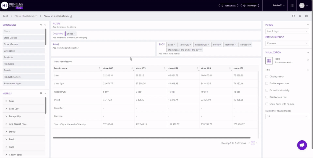
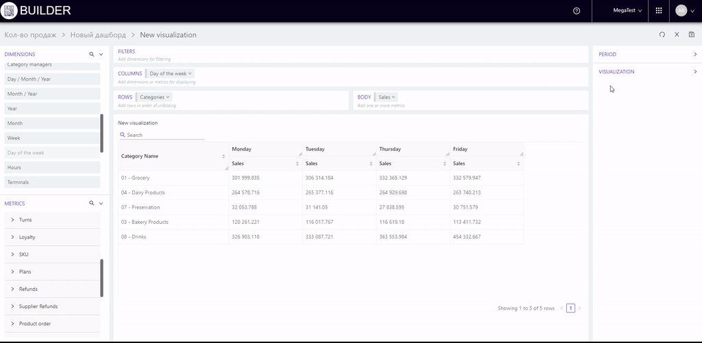
For example, we add days of the week to the "Rows", add stores to the "Columns", and drag the indicator "Sales" from metrics "Sales" to the "Body".
As a result, we get a table with sales in terms of stores by days.

Metrics can be analyzed in relation to any dimension.
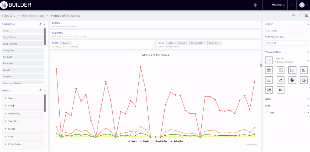
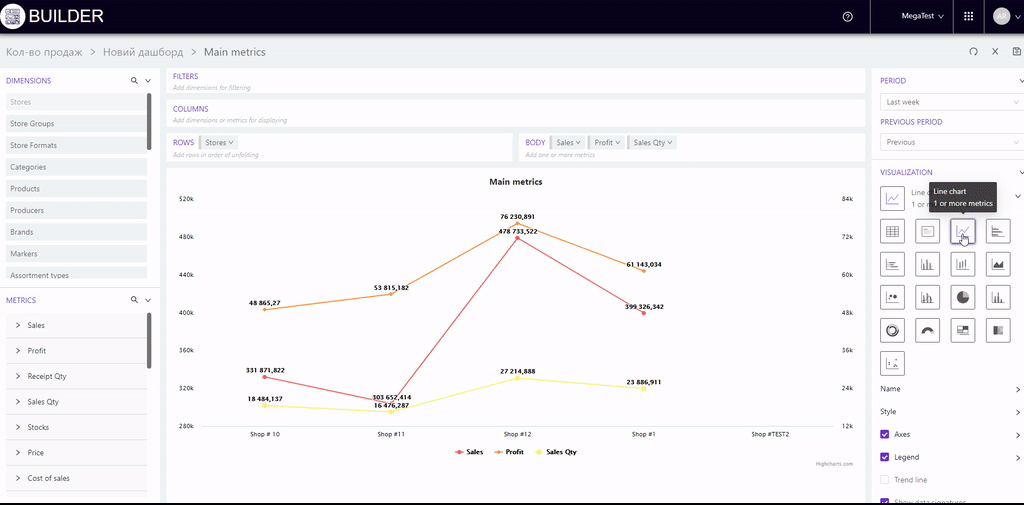
For example, we will add stores to "Columns", and metrics to "Rows": Sales, Receipts qty, Sales qty and Avg receipt price.
We get a table with the main metrics for stores for the selected period.
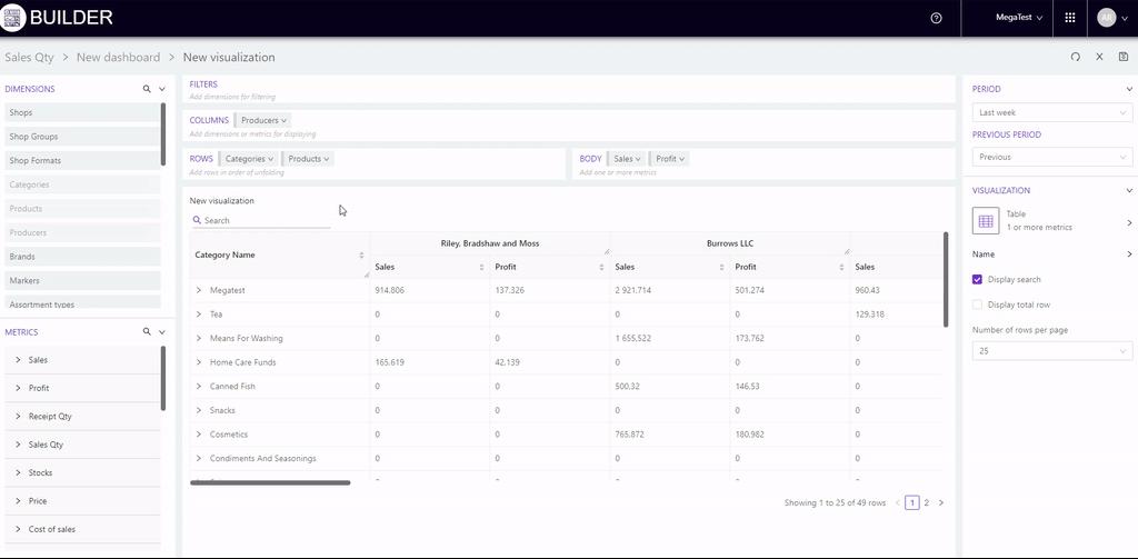
Construction of tables with multilevel columns
To do this, add dimensions to the blocks "Columns" and "Rows", and add several metrics to the block "Body".
For example, we will add stores to "Columns", products to "Rows", and metrics to "Body": Sales, Profit, Sales qty.
Then we get a table where the selected metrics for the selected products will be grouped by store.
Edit and delete an added indicator
To do this, just click on them and select the desired action in the pop-up window:
- "Filter values (action not available if dimensions are added to both "Rows" and "Columns") - allows to filter numeric data in the table. To do this, in the modal window, you can select the condition (more / less than, equal, top, top, antitop, between) and the number that will complement it.
- "Edit title" - allows to change the name of the indicator, taking into account the characteristics of the client.
- "Number of decimal places" - allows to set the number of decimal places for the selected indicator and see what it will look like.
- “Placement settings” - gives an opportunity to specify the placement of the metric in the table:
- A separate column (At the beginning of the table or At the end of the table),
- Attach to the dimension (it is necessary to select the desired dimension)
- "Delete" - deletes the indicator from the table.
Note! The "Placement settings" is used only for the following metrics: Identifier, Barcode and Stock Qty at the end of the day.
The "Placement settings" is not displayed in the pop-up window if:
- added only one possible metric (Identifier/Barcode/Stock Qty at the end of the day);
- the metric is in the "Columns" block;
- there is no dimension in the blocks "Columns" and "Rows".
Setting the period
You can select the period for analysis in the block "Period" (on the right side of the page), which contains the fields:
- Period - allows to choose from the proposed list the time interval to display the data on the visualization.
If "Set date" is selected, then below it a field appears where you can manually set the period on the calendar.
- Previous period - allows to select the period of time for comparison with the selected period. The comparison period is automatically set to the same duration as the selected period.
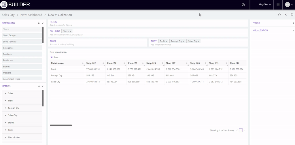
Table Settings
You can perform the following actions with the visualization table:
- sort metrics;
- change the width of the columns;
- set the number of rows to be displayed on the page.
Using the field "Number of rows per page" (on the right panel of the "Visualizations" block) you can additionally set the parameters of data display in the table (10, 25, 50, 100 rows on one page).
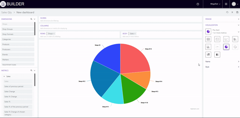
Choice of visual display
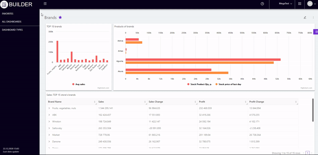
Once the analysis data is generated, it is necessary to select the type of visual display.
In the block "Visualization" (on the right side of the page) 17 icons are shown for types of visualizations that will be active depending on the selected metrics and dimensions. When you hover the cursor over their icons, a window appears with the name of the visualization and the requirements for its application. If the requirements are not met - the icon is inactive. Available visualizations are shown in color.
"Table" is set by default.
To change the visualization type, you need to click on the desired active icon. The selected visualization will be highlighted in purple. Clicking on another icon immediately changes the selected visualization type.
Block "Name" (on the right of the page) unfolds after clicking on the arrow to the right and contains:
-
Checkbox "Visualization title" - displays / hides the title on the visualization.
-
Field "Visualization name" - allows you to enter the name of the graphic image.
-
Field "T" - designed to change the font size of the name.
-
Font buttons: bold, italic, underline, strikethrough.
- Two fields to select the location of the visualization name: left, right, center (in one field) and top, bottom (in another field).
- Field "Color of title" - allows to select the color in which the text will be displayed title. It provides self-adjustment of colors.
Block "Style" (right side of the page) after clicking on the arrow on the right side it unfolds and contains:
- Field "Color of elements" - allows to choose colors from the customized colors or apply different shades of the same color to the visualization elements. To adjust your own hue, just click on the cell with the desired color and select the desired one on the proposed palette.
- Field "Text color" - allows to select the color in which the text will be displayed (legend, data captions, axes). It provides self-adjustment of colors and their shades.
Block "Axes" (right side of the page) is only available for visualizations that assume axes. After clicking on the arrow on the right, the block expands and contains the following:
- Checkbox "Axes" - displays / hides the axis on the visualization.
- Checkbox "Enable double axes" - adds / hides an additional axis on the visualization.
- Field "Name of the vertical axes" - a field in which you can enter the name of the vertical axis.
- Field "Borders" - allows you to set the maximum and minimum values of the axis boundaries. The field is available for the axis, which contains added metrics.
- Field "Name of the horizontal axes" - a field where you can enter the name of the horizontal axes.
Block "Legend" (right side of the page) is only available for visualizations that assume a legend. After clicking on the arrow, the block expands and contains two fields to select the location of the legend: on the left, on the right, centered (in one field) and at the top, in the middle, at the bottom (in another field).
Additional settings of visualization:
- Check-box "Trend line" - displays / hides the trend line on the visualization.
- Check-box "Show data signatures" - adds / hides the values of visualization elements.
- Check-box "Smooth the line" - smooths / returns to the original appearance of the visualization line.
- The field "In the absence of data" - allows you to select the display parameters in the case when there is no data: cut off the line or reduce to zero.
Available for the table (on the right of the page):
-
Checkbox "Display search" - displays / hides the search bar above the visualization table.
-
Checkbox "Display total row" - summarizes the metrics and displays the value of "total" on them.
-
Field "Number of rows per page" - allows you to select the parameters of data display in the table (10, 25, 50, 100).