Sections
Basket AnalysisQuadrant analysisProducers analysisStore cardProduct CardBrand salesPlanogram EfficiencyLost SalesSuppliers salesCategories salesCategory managersStores salesSales ChangeCategory CardMarkers comparisonProducts salesUnsaleable productsPrediction of OoS24-Hour AnalysisProducts movementEffectiveness of сashiersProducts for adjustmentPOS-terminal TrafficSales PlansNew SKUEffectiveness of Loyalty ProgramPromo CardStatistic of Loyalty ProgramCustomer Loyalty SegmentationLoyalty CardComparative DynamicsReceiptsStock MonitoringMainPromotion AnalysisRFM - analysisCATEGORIES SALES
Reports on Datawiz BI service
The "Category Sales" report is designed to evaluate the main metrics of sales in the context of chain categories. It contains two tabs: Report and Sales Structure.
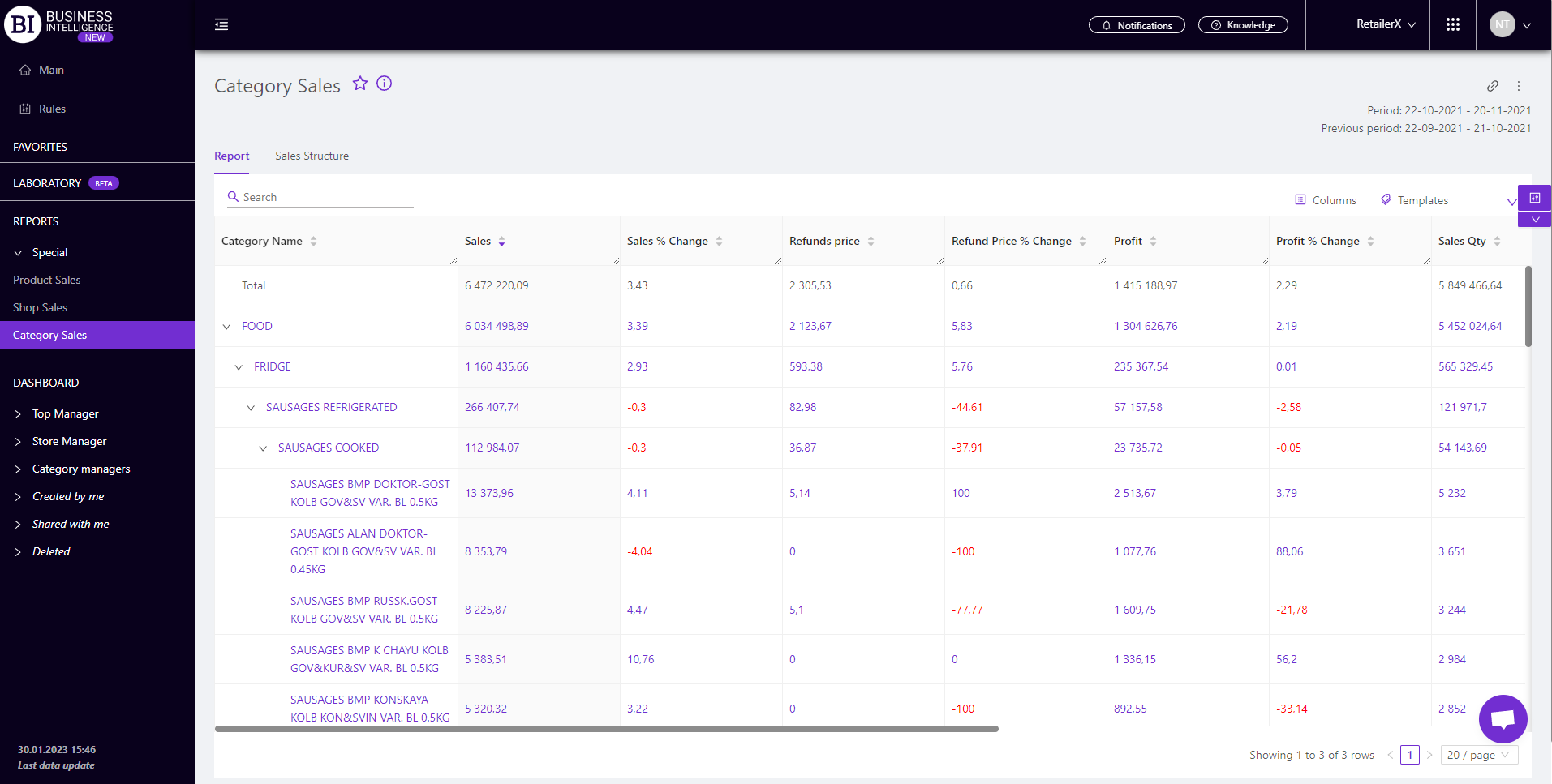
Report
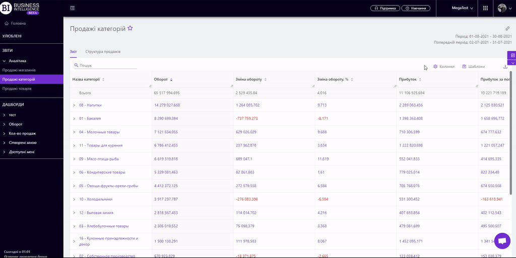
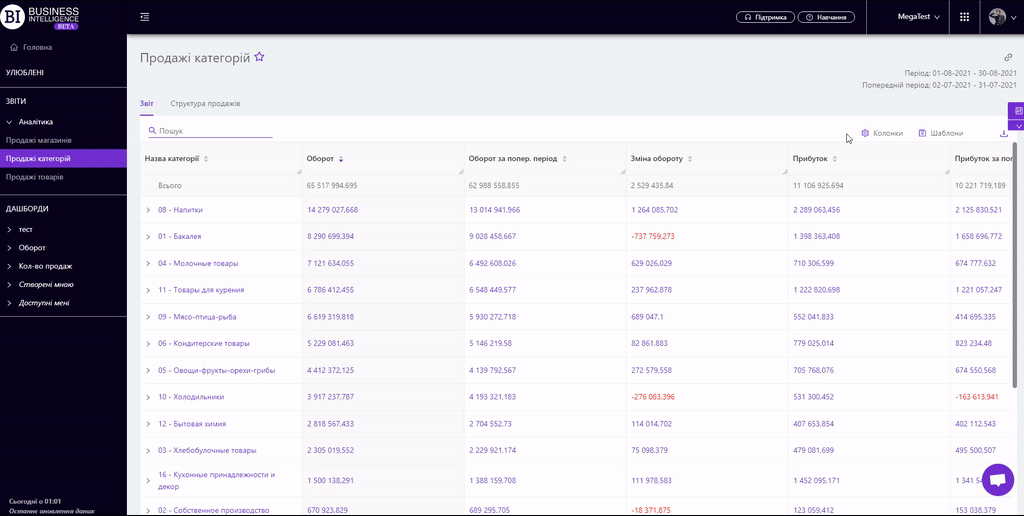
The "Report" tab contains a table with the main metrics of the category sales. Using the report you can:
- view the necessary data for two periods: "Chosen" and "Previous", comparing them with each other;
- analyze the main metrics at each level of the category tree, going down from the top-level categories to the SKU;
- visually track the dynamics of key metrics;
- evaluate the contribution of each category to the overall sales metrics.
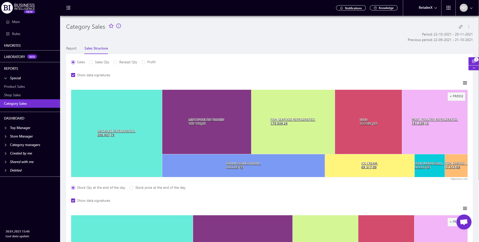
Sales Structure
The "Sales Structure" tab contains two visualizations that allow to compare the shares of key sales metrics and balances of each category for the chosen period:
- upper visualization represents the structure of the category sales and is based on one of the metrics: Sales, Sales Qty, Receipt Qty, Profit.
- bottom visualization shows the structure of the balance and is based on one of the metrics: Stock Qty, Stock Primecost.
To change the metric on the visualization you need to activate the check-box next to the necessary metric above the visualization icon.
The visualizations are interconnected. When hovering over a category name in one of the visualizations, pop-ups with percentages and quantities of category sales or its stock balances appear on both of them.
Using this information will allow to bring the balance of sales and stocks to the optimal level.
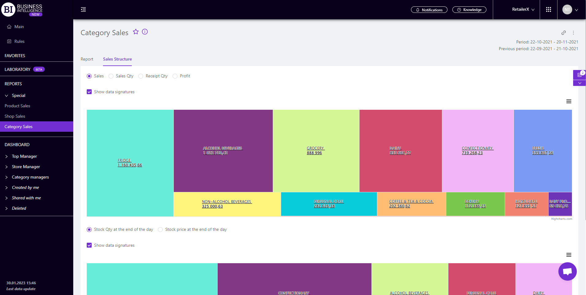
Visualizations can be expanded to the necessary level of the category tree. To do this, click on the necessary category. After that both visualizations fall into this category and show the structure of sales/stocks by its' subcategories.
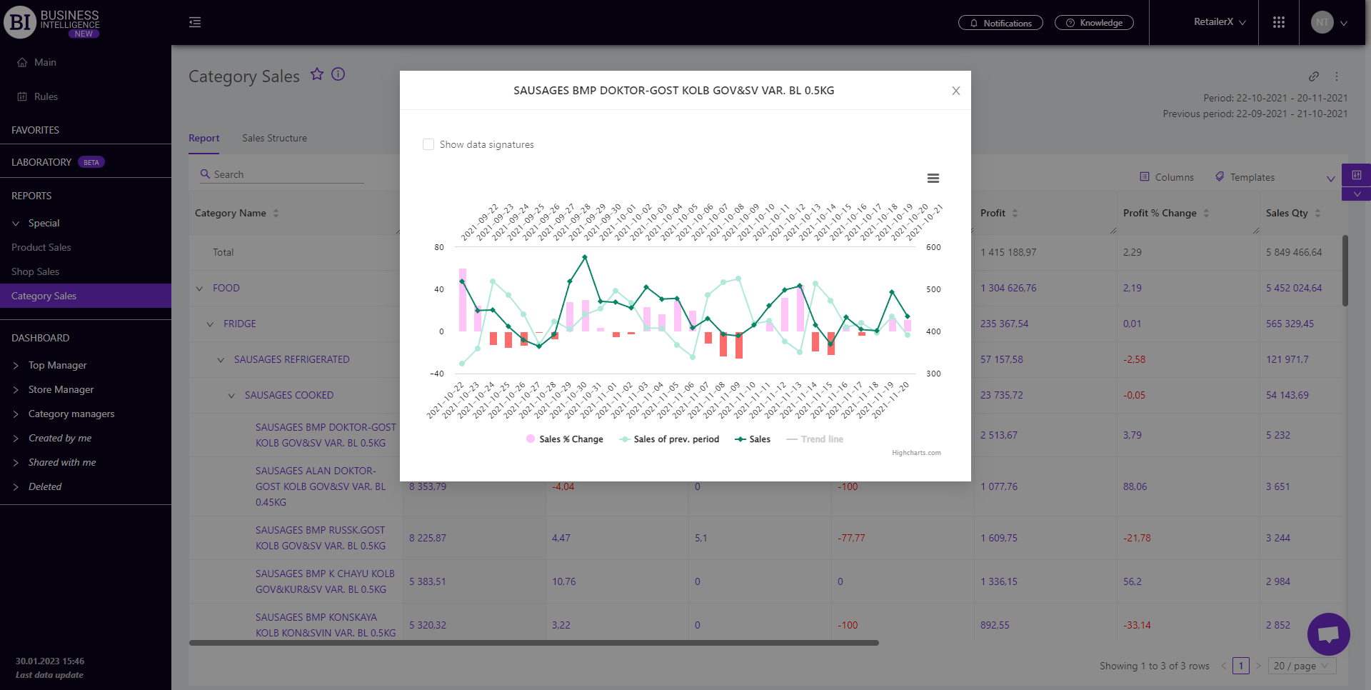
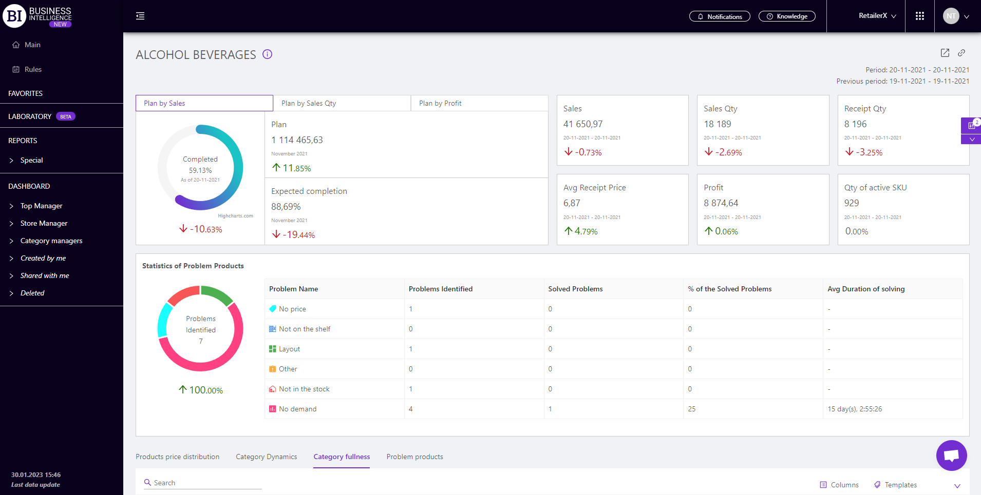
Category Card
Clicking on the name of the category in the report table will open the "Category Card" which shows the basic information for the chosen period.
Metrics
"Columns" button allows to choose the necessary metrics for generating a report. All metrics are divided into the following subgroups:
-
Qty change of active SKU, %
-
Share of returns by sales Qty, %.
Note! Access to viewing the metrics according to the user's role is determined by the administrator. Contact your administrator to expand the access.
Metrics highlighted in purple or red are clickable. Clicking on them opens a window with a flow chart of the chosen metric.
Advice! If you need to compare the metric for the chosen and the previous period, it is necessary to click on the necessary clickable metric for the previous period. The graph will display curves for two periods: the chosen one and the previous one.
"Templates" button - saves the configured report columns as a template.
On the right above the table a context menu is opened where the user can select the following actions:
- "Lock the total row" - fixes the "Total" row in the top row of the table.
- "Save XLS" - saves table data to an xls-file.
To quickly find the necessary category enter the first letters/symbols of the category name in the search field. The search works automatically, leaving all found matches in the table.
To reset the search results click on the cross in the search field.
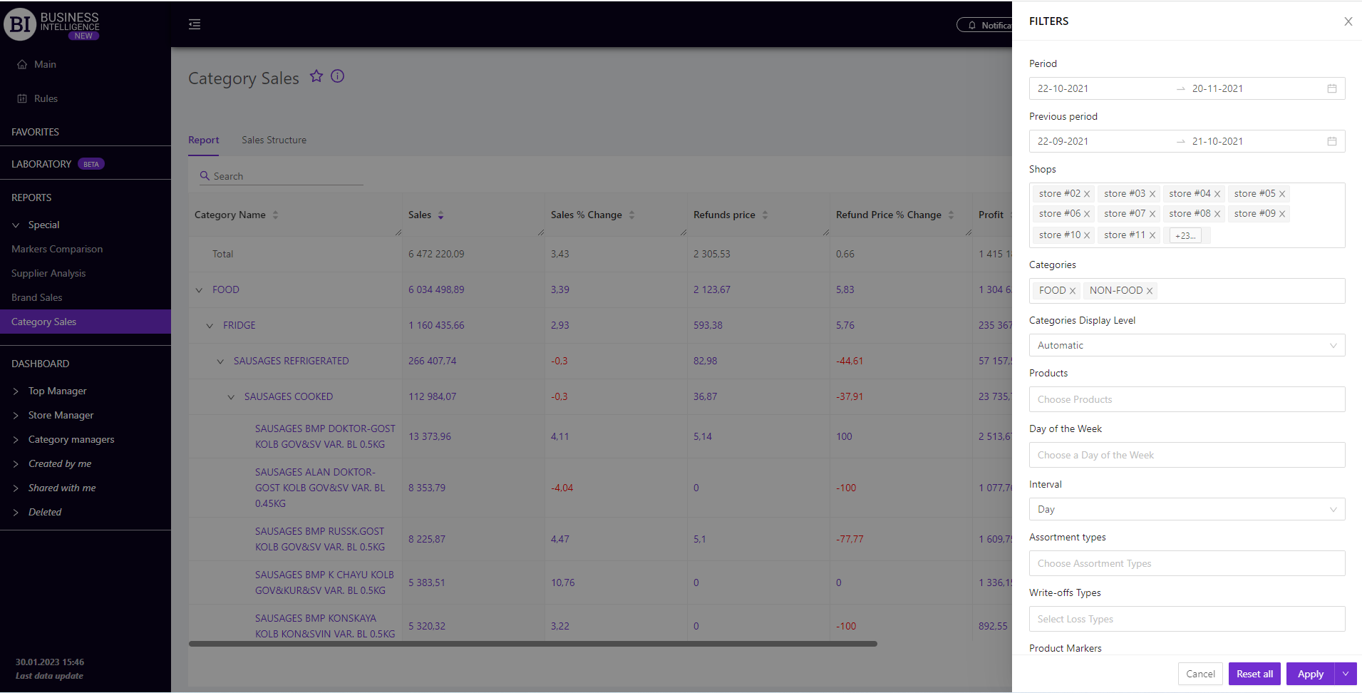
Filters
The selection of filters makes it possible to carry out the analysis within the specified conditions.
Filters button is placed on the right side above the report. Clicking on it opens a modal window with the following filters:
- Period
- Previous period
- Stores
- Categories
- Categories Display Level
- Products
- Day of the week
- Interval
- Assortment types
- Write-off Types
- Product Markers
- Receipt Markers
- Like for Like