Sections
Basket AnalysisQuadrant analysisProducers analysisStore cardProduct CardBrand salesPlanogram EfficiencyLost SalesSuppliers salesCategories salesCategory managersStores salesSales ChangeCategory CardMarkers comparisonProducts salesUnsaleable productsPrediction of OoS24-Hour AnalysisProducts movementEffectiveness of сashiersProducts for adjustmentPOS-terminal TrafficSales PlansNew SKUEffectiveness of Loyalty ProgramPromo CardStatistic of Loyalty ProgramCustomer Loyalty SegmentationLoyalty CardComparative DynamicsReceiptsStock MonitoringMainPromotion AnalysisRFM - analysisPROMO CARD
Reports on Datawiz BI service
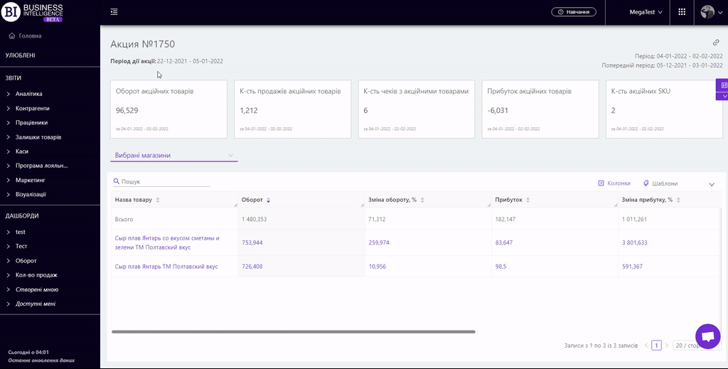
The "Promotion Card" report summarizes the main data on promotion and allows to analyze them in dynamics, comparing several metrics in the promotional and non-promotional period.
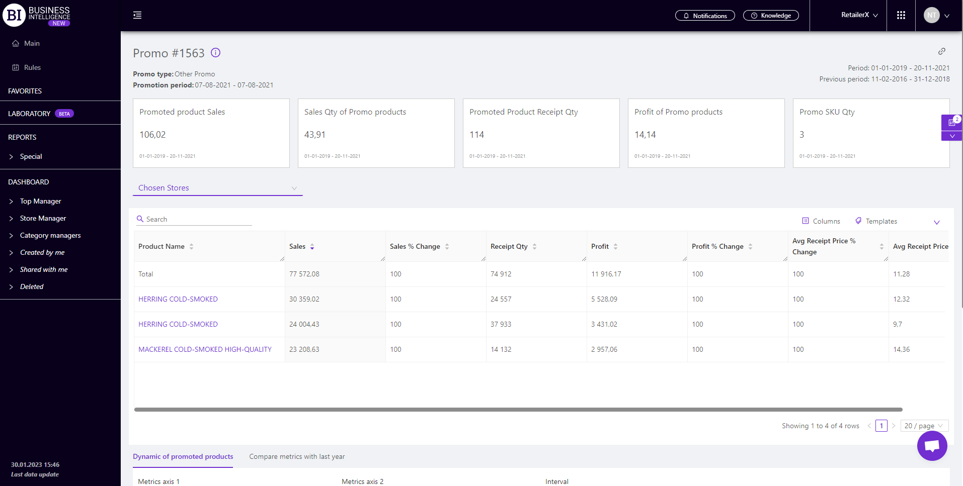
There are information cards with the metrics at the top. They display basic information about the metrics of the promotion for the chosen period, namely:
- Promoted Products Sales
- Sales Qty of Promoted Products
- Promoted Products Receipt Qty
- Profit of Promoted Products
- Promoted SKU Qty
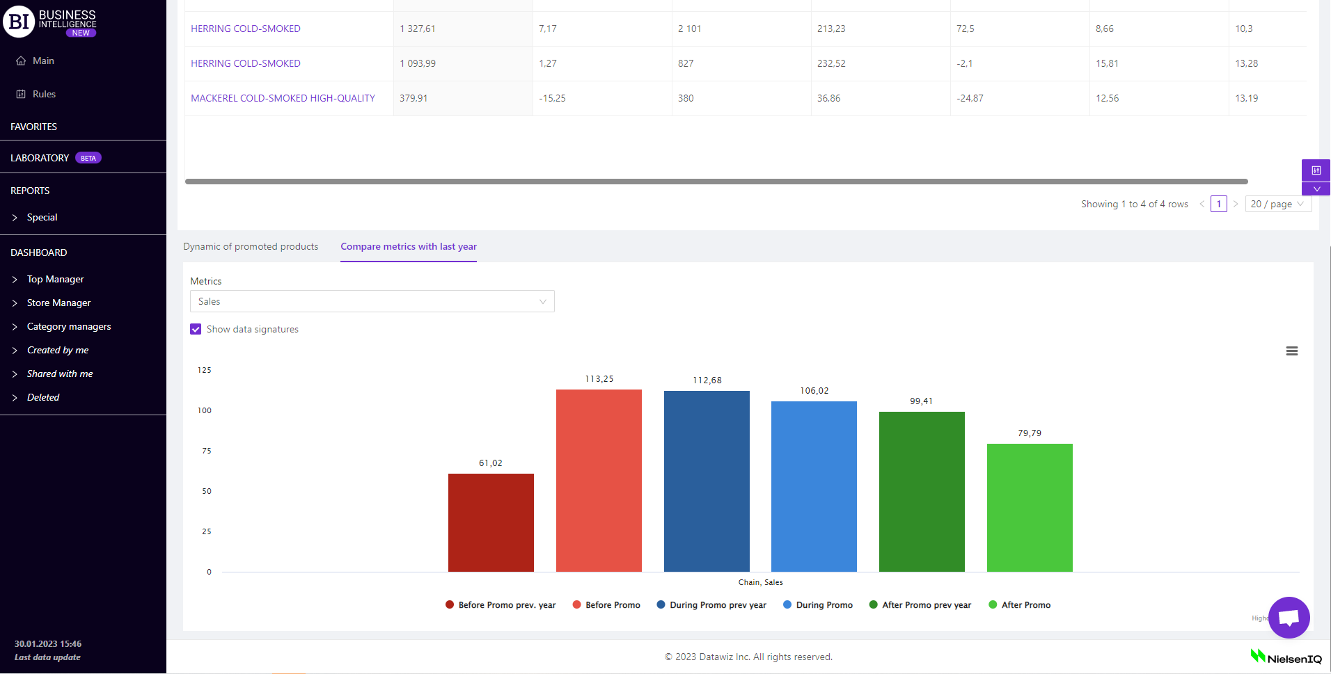
 There is a table below that shows the sales of all promoted products for the chosen period.
The table is formed for each store separately or for the chain as a whole. To choose a store click on "Chosen stores" field on the left above the table and choose the necessary store from the pop-up list.

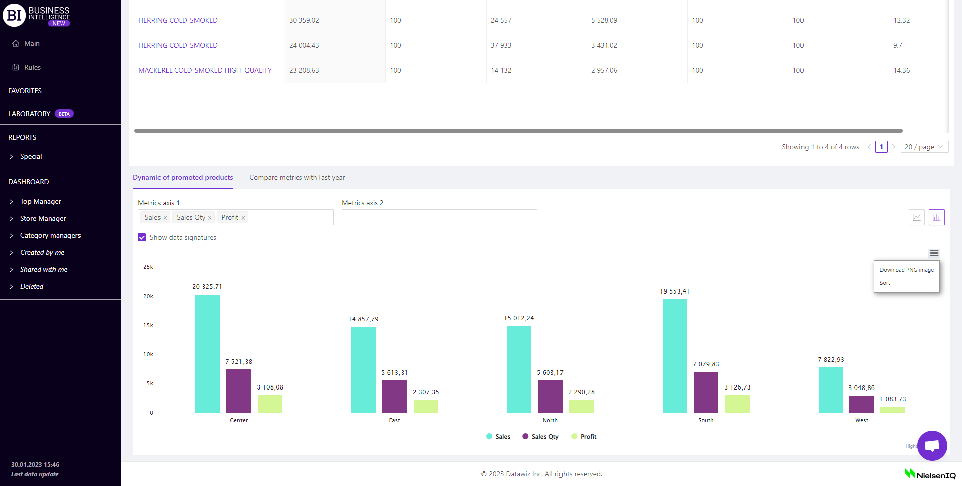
There are two tabs: Dynamic of promoted products and Compare metrics with last year under the table of the report.
The "Dynamic of promoted products" tab contains a visualization of the promoted products sales dynamics in the chain. You can choose the following when creating the graph:
- metrics of axis 1 and 2 - two fields on the left above the visualization which allow to choose the following metrics from the pop-up list:
To choose the necessary metric simply mark it with a flag. You can display up to 5 metrics at the same time for visualization.
- intervals - the field on the right above the visualization which allows to set one of the proposed intervals:
- Day/Month/Year
- Month / Year
- Year
- Month
- Week
- Day of the week
- Hours
Mark the cell with the flag - Show Data Signatures (on the left above the visualization) to display the values of metrics.
Available visualization types: line graph, table graph.
Note! For a bar chart the Interval field is not available. However, the context menu (in the upper right corner of the visualisation) allows to download the visualisation in png format and sort the visualisation by one of the indicators in ascending/descending order.
The "Compare metrics with Last Year" tab contains a visualization that allows you to compare the sales of products that were included in the promotion for the pre-promotional, promotional, and post-promotional period with similar previous year metrics.
In the "Metrics" field on the left above the visualization you can select one of the following metrics:
Mark the cell with the flag - Show Data Signatures (on the left above the visualization) to display the values of metrics.
Metrics
"Columns" button allows to select the necessary metrics for generating a report.
All metrics are divided into subgroups:
Sales
Sales Qty
Receipt Qty
Avg Receipt Price
Stocks
- Stock Qty at the end of the day
- Stock Qty at the end of the day Change
- Stock Qty at the end of the day Change, %
- Stock price at the end of the day
- Stock Price at the end of the day Change
- Stock Price at the end of the day Change, %
Profit
Price
- Price
- Price Change
- Price Change, %
- Cost-price
- Cost-price Change
- Cost-price Change, %
- Actual Price
- Actual Price Change
- Actual Price Change, %
Discounts
Assortment activity
Promotional metrics
- Qty of promo days with sales
- Sales Goal
- Sales Goal complete, %
- Profit Goal
- Profit Goal complete, %
- Sales Qty Goal
- Sales Qty Goal complete, %
Note! Access to viewing metrics, according to the user's role, is determined by the administrator. Contact your administrator to expand the access.
Metrics highlighted in purple or red are clickable. Clicking on them opens a window with a flow chart of the chosen metric.
Advice! If you need to compare the value of the metric for the selected and previous period, you need to click on the necessary clickable metric for the previous period. The graph will contain curves for two periods: selected and previous.
"Templates" button - saves the configured report columns as a template.
On the right above the table a context menu is opened where the user can select the following actions:
- "Lock the total row" - fixes the "Total" row in the top row of the table.
- "Save XLS" - saves table data to an xls-file.
To quickly find the necessary promo product, enter the first letters/symbols of the promo product name in the search field. The search works automatically, leaving all found matches in the table.
Click on the cross in the search field to reset the search results.

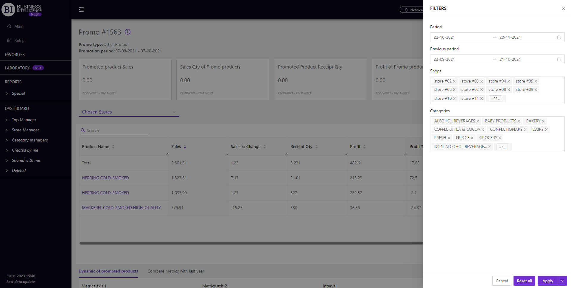
Filters
The selection of filters makes it possible to carry out the analysis within the specified conditions.
Filters button is placed on the right side above the report. Clicking on it opens a modal window with the following filters:
- Period
- Previous Period
- Stores
- Categories