Sections
Basket AnalysisQuadrant analysisProducers analysisStore cardProduct CardBrand salesPlanogram EfficiencyLost SalesSuppliers salesCategories salesCategory managersStores salesSales ChangeCategory CardMarkers comparisonProducts salesUnsaleable productsPrediction of OoS24-Hour AnalysisProducts movementEffectiveness of сashiersProducts for adjustmentPOS-terminal TrafficSales PlansNew SKUEffectiveness of Loyalty ProgramPromo CardStatistic of Loyalty ProgramCustomer Loyalty SegmentationLoyalty CardComparative DynamicsReceiptsStock MonitoringMainPromotion AnalysisRFM - analysisCATEGORY CARD
Reports on Datawiz BI service
The "Category Card" report summarizes the basic information on the category and allows to analyze it in the dynamics, comparing several metrics at once.
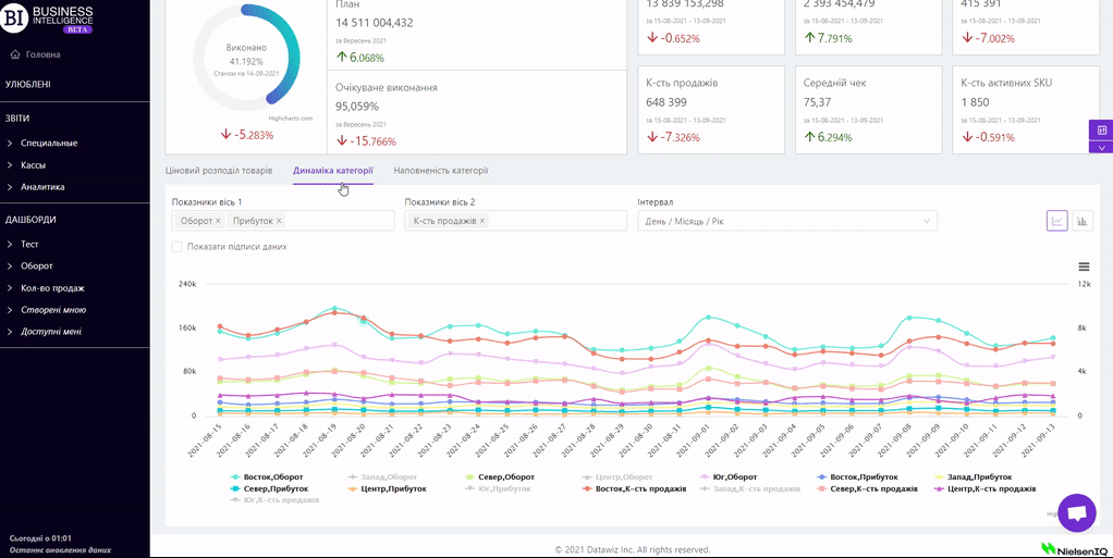
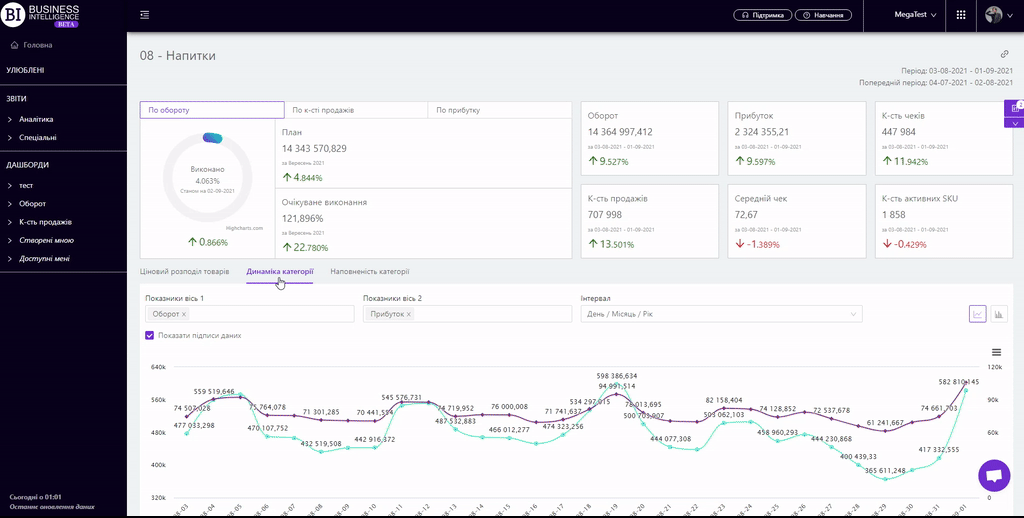
There is general information on categories at the top of the report.
There is a block of execution of the plans on three metrics on the left: Sales, Sales Qty, Profit on the left side. It consists of:
- circular graph which shows the percentage of execution of the plan as of the date of the last data downloading to the server;
- plan for the chosen metric for the current month;
- expected plan execution in %.
Note! To change the metric you need to use the navigation at the top of the block.
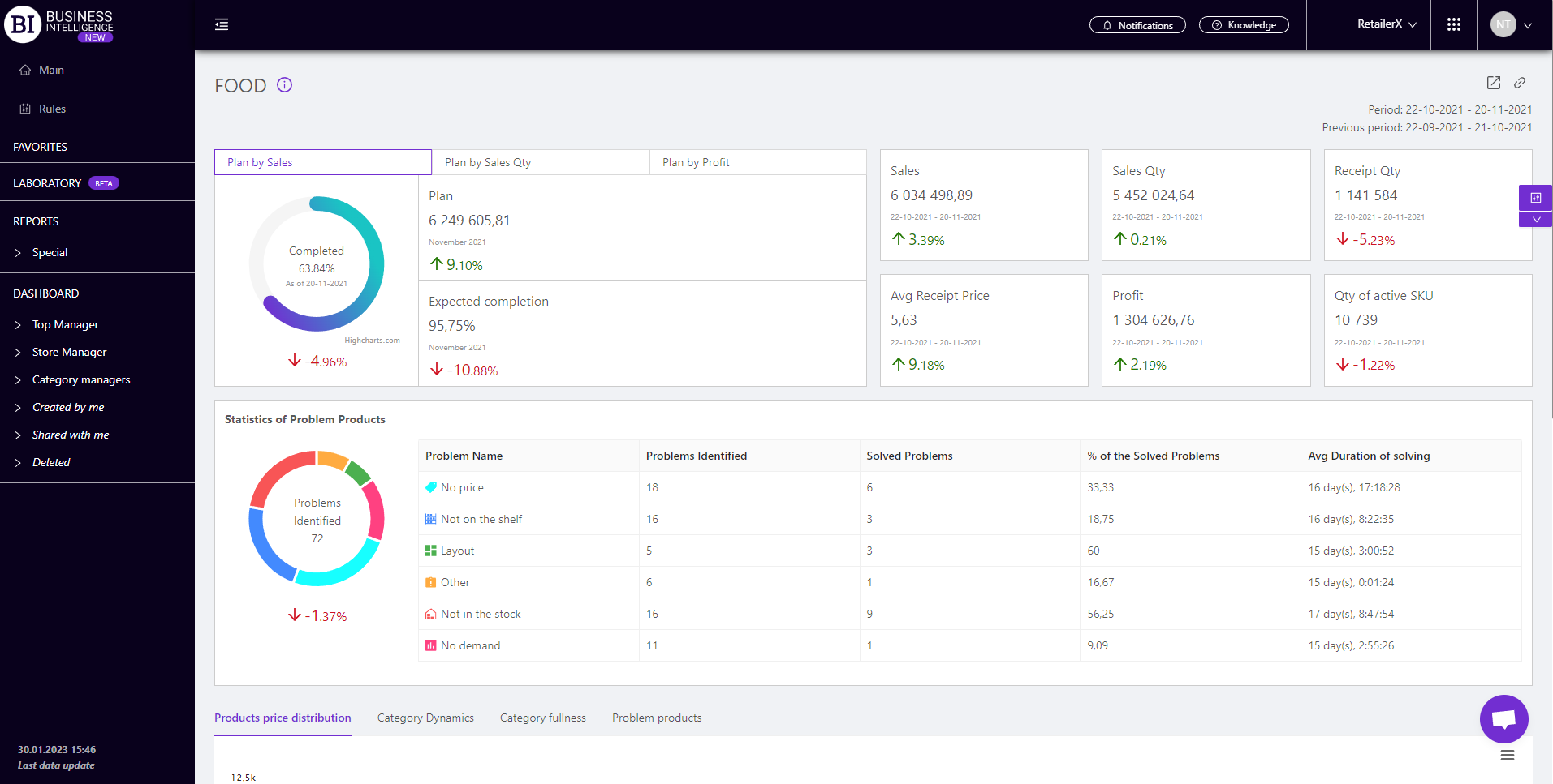
There are information cards on the right. They display basic information about the status of the store, namely:
The cards indicate:
- actual value of metrics for the chosen period;
- chosen period;
- dynamics of the metric: green color and up arrow indicate an increase of the metric, and red color and down arrow - decrease of the metric.
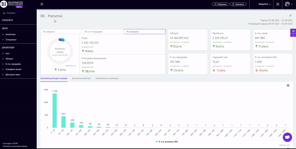
There are three tabs (Products Price Distribution, Category Dynamics, Category Fullness) below in the report.
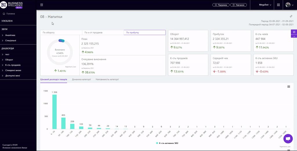 The "Products Price Distribution" tab contains two charts: the top one shows the SKU distribution according to price range, and the bottom one shows the profit and sales distribution.
When you hover over the necessary column on one of the diagrams, their metrics appear as follows:
- at the top - SKUs quantity, and their category percentage;
- at the bottom - the value of sales and profit of the respective SKU, and their category total value percentage.
You can choose the value of the price range (10, 20, 50, 100, 200, 500), or specify a manual setting of it in the filters.
Clicking on the chart column opens a table with a list of products in this price range.
"Columns" button allows to choose the metrics required by the user to generate a report.
All metrics are divided into subgroups:
Sales
Profit
Receipt Qty
Sales Qty
Stock
- Stock Qty at the end of the day
- Stock Qty at the end of the day Change
- Stock Qty at the end of the day Change, %
- Stock price at the end of the day
- Stock Price at the end of the day Change
- Stock Price at the end of the day Change, %
Price
- Price
- Price Change
- Price Change, %
- Сost-price
- Сost-price Change
- Сost-price Change, %
- Actual price
- Actual price Change
- Actual price Change, %
Avg Receipt Price
Finance metrics
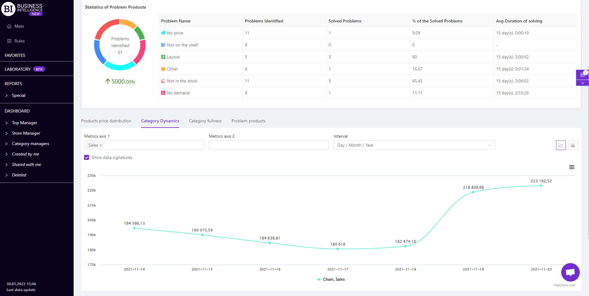
The "Category Dynamics" visualization shows the change of chosen metrics for this store for the chosen period.
Above the graph there are two fields for customizing the display of visualization:
- Metrics - allow to choose the following indicators from the pop-up list:
- Sales
- Profit
- Receipt Qty
- Sales Qty
- Stock Qty at the end (start) of the day
- Stock price at the end (start) of the day
- Avg Receipt Price
- Product Profitability, %
- Markup %
- Margin %
- GMROI %
- Turns in monetary units
- Qty of active SKU
- VAT
- Excise
- Stock Qty at the beginning of the day
- Stock price at the beginning of the day
Note! No more than six metrics can be displayed at a time.
- Interval - allows to set one of the proposed intervals:
- Day/Month/Year
- Month/Year
- Year
- Month
- Week
- Day of the Week
- Hours
To display data signing, you must activate the corresponding checkbox above the visualization.
Available visualization types: line graph, column graph.
Note! The Interval field is not available for the column graph. However it is possible to sort the metrics by ascending/descending. After clicking on it a pop-up window opens you can choose the metrics and the direction of sorting from.
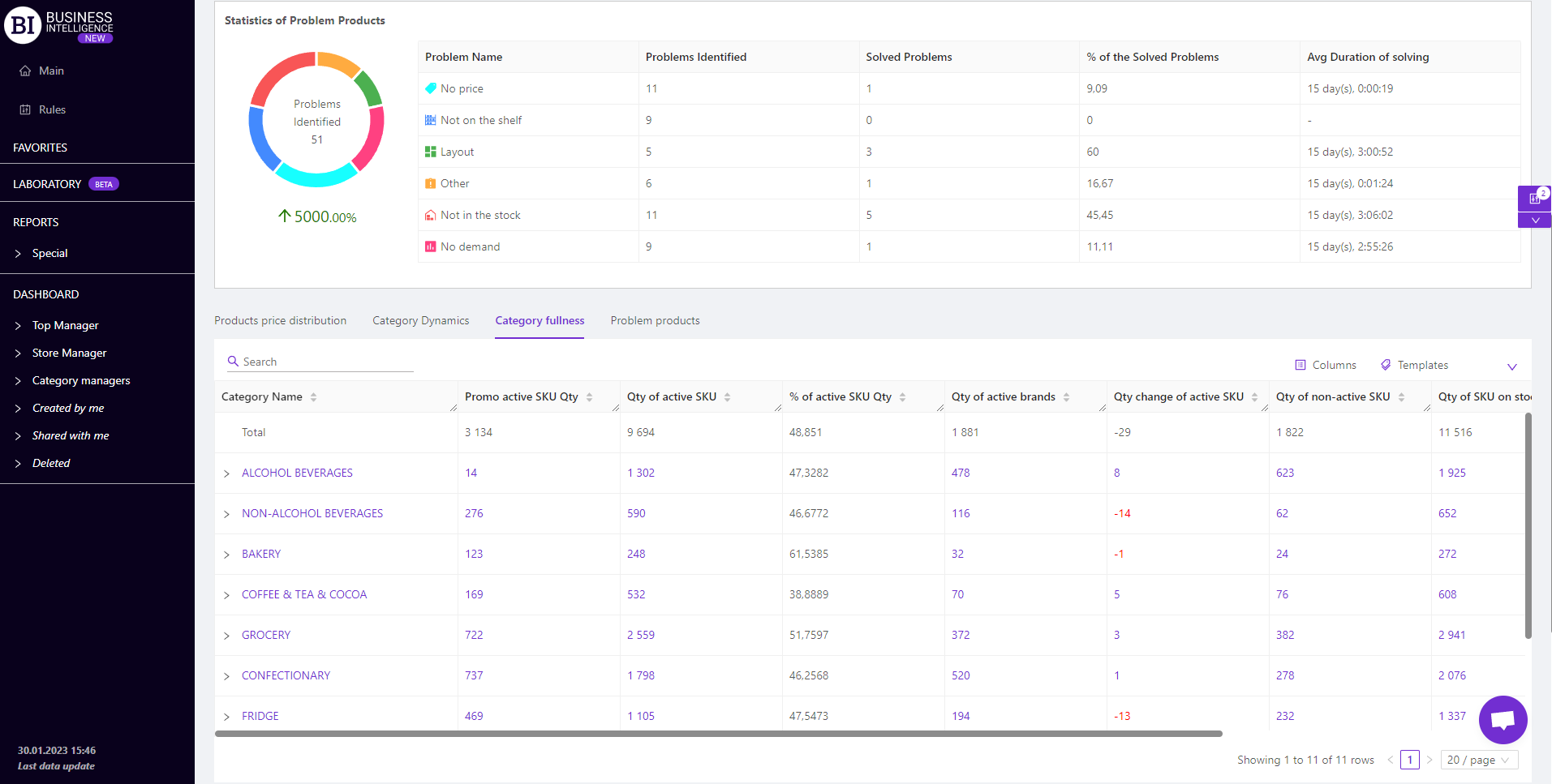
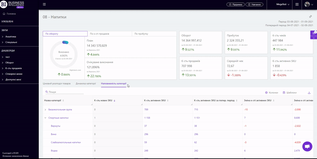
 The "Category Fullness" tab contains a table with the main metrics of the category width.
"Columns" button allows to choose the metrics for generating the report on:
- Count of SKU
- Qty of new SKU
- Qty of active SKU
- Qty change of active SKU
- Qty change of active SKU, %
- % of active SKU Qty
- Promo active SKU Qty
- Promo active SKU Qty Change
- Promo active SKU Qty Change, %
- % of active Promo SKU Qty
- Qty of SKU on stock
- Qty of SKU on stock Change
- Qty of SKU on stock Change, %
- Qty of non-active SKU
- Qty of non-active SKU Change
- Qty of non-active SKU Change, %
- % of inactive SKUs
- Change of inactive SKUs, %
- Qty of active brands
- Qty of active brands change
- Qty of active brands change, %
 On the tab "Products Price Distribution" there is “Templates” button above the tables on the right - saves custom report columns as a template.
On the right above the table a context menu is opened where the user can select the following actions:
- "Lock the total row" - fixes the "Total" row in the top row of the table.
- "Save XLS" - saves table data to an xls file.
To quickly find the necessary section of the first column of the table, simply enter the first letters/symbols of its' name in the search field. The search works automatically, leaving all the matches found in the table.
To reset the search results, click on the cross in the search box.
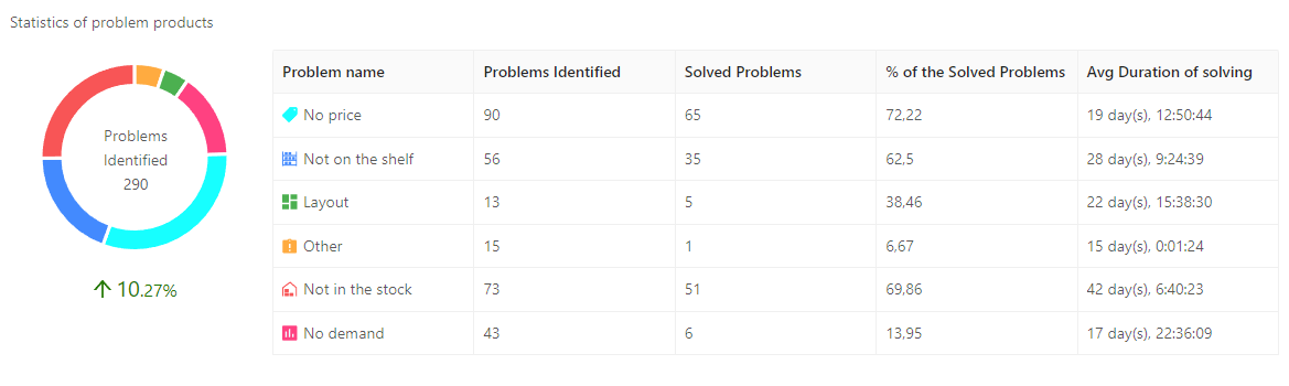
Statistics of problem products
The block "Statistics of problem products" displays information about all identified problems by category, statistics of their occurrence and resolution.
You can also analyze this information on the Store and Product Card.
Statistics are collected from the mobile application Store Manager.
"Problem Products" tab
The tab allows you to analyze detailed information about problematic products of a certain category.


The table allows to see detailed information about problem products in which store which problem was detected, the time of moving and solving the problem, and information about users, their comments, who moved the problem and solved it.
Data in the table can be filtered by problem.
Metrics
The "Columns" button allows to select the metrics required by the user to generate a report:
- Identifier
- Barcode
- Problems Identified
- Problems Identified Change
- Problems Identified Change, %
- Unique Problems Identified
- Unique Problems Identified Change
- Unique Problems Identified Change, %
- Solved Problems
- Solved Problems Change
- Solved Problems Change, %
- % of the Solved Problems
- Date of problem identification
- Date of problem solving
- Avg Duration of solving
- Duration of solving
Note! The problem products block is displayed for the following types of roles:
- Owner
- Shop manager
- Category manager
- Analyst
- Regional manager
- Top Manager
Filters
The selection of filters makes it possible to carry out the analysis within the specified conditions.
Filters button is placed on the right side above the report. Clicking on it opens a modal window with the following filters:
- Period
- Previous period
- Stores
- Interval
- Day of the week
- Price range
- Products
- Brands
- Category managers
- Suppliers
- Producers
- Product markers
- Receipt markers
- Types of clients
- Assortment types
- Bonus types
- Like for Like
