Sections
Basket AnalysisQuadrant analysisProducers analysisStore cardProduct CardBrand salesPlanogram EfficiencyLost SalesSuppliers salesCategories salesCategory managersStores salesSales ChangeCategory CardMarkers comparisonProducts salesUnsaleable productsPrediction of OoS24-Hour AnalysisProducts movementEffectiveness of сashiersProducts for adjustmentPOS-terminal TrafficSales PlansNew SKUEffectiveness of Loyalty ProgramPromo CardStatistic of Loyalty ProgramCustomer Loyalty SegmentationLoyalty CardComparative DynamicsReceiptsStock MonitoringMainPromotion AnalysisRFM - analysisSALES CHANGE
Reports on Datawiz BI service
The "Sales Change" report is designed to quickly find the reasons for the decline, or increase sales metrics at all levels, from shops/categories, and down to the SKU. It contains charts showing changes in chain sales. Clicking on a visualization element forms a chart of the next lower level, and such a fall allows you to identify which categories, shops, or products caused a change in performance.
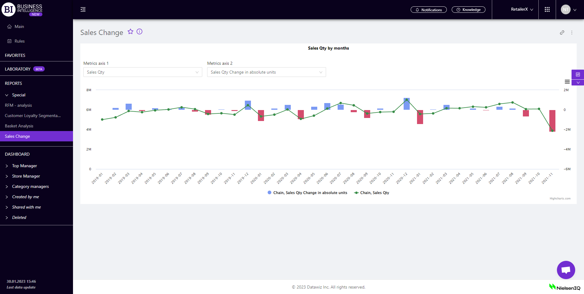
Two fields are intended for visualization build-up:
- Metrics Axis 1 - allows you to choose the following metrics from the pop-up list :
- Metrics Axis 2 - allows you to choose one of the following metrics:
- Off Change
- Increase in absolute units
- % Increase
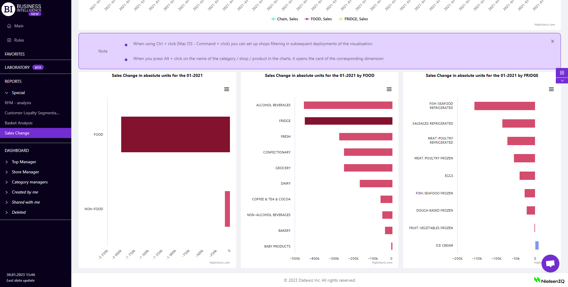
Pressing Alt + click on the name of the shop/category/productin the charts opens the cards of the corresponding section: Shop Card, Category Card, and Product Card.
Using Ctrl + click (Mac OS - Command + Click) when deploying chart metrics, you can change the level at which visualizations will be drawn in the future. That is, if the "Category" level has been set in the filters, the following diagrams of the lower categorization levels will be changed to stores, and vice versa, - the "Shop" level on the visualizations will be changed to categories.
Note! Clicking on the top visualization by months opens all subsequent visualizations for the chosen month, clicking on the visualization by days - opens visualizations for the chosen day.
Cancel button - closes all visualizations, leaving the first visualization with chain sales.
Filters
The selection of filters makes it possible to carry out the analysis within the specified conditions.
 button is placed on the right side above the report. Clicking on it opens a modal window with the following filters:
- Stores
- Compare with
- Level
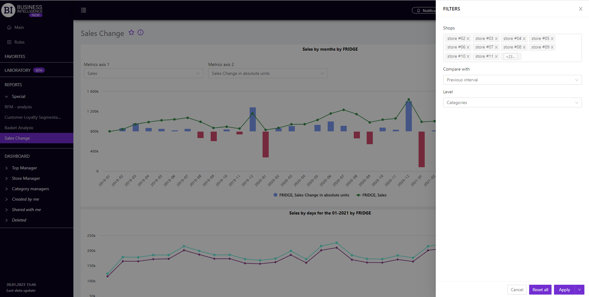
Note! After setting and saving the filters, a number, indicating the quantity of preset filters, is displayed on  button.