Sections
Basket AnalysisQuadrant analysisProducers analysisStore cardProduct CardBrand salesPlanogram EfficiencyLost SalesSuppliers salesCategories salesCategory managersStores salesSales ChangeCategory CardMarkers comparisonProducts salesUnsaleable productsPrediction of OoS24-Hour AnalysisProducts movementEffectiveness of сashiersProducts for adjustmentPOS-terminal TrafficSales PlansNew SKUEffectiveness of Loyalty ProgramPromo CardStatistic of Loyalty ProgramCustomer Loyalty SegmentationLoyalty CardComparative DynamicsReceiptsStock MonitoringMainPromotion AnalysisRFM - analysisCOMPARATIVE DYNAMICS
Reports on Datawiz BI service
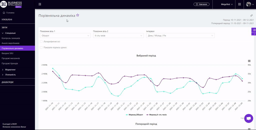
The "Comparative Dynamic" report is designed to compare the dynamics of sales by category and product at the same time.
It contains 3 graphs: Selected Period, Previous Period, and Change in absolute units.
Graphs show the dynamics of sales by chosen categories and products. Functional graphs allow to:
- track how the sales have changed in the chosen and previous periods;
- identify periods when there has been a decrease or increase of sales;
- establish patterns of sales of various categories and products.
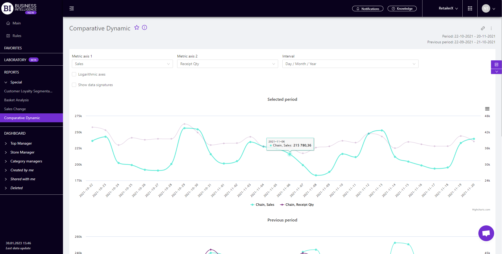
You can choose the following when creating the graph:
- Metrics of Axis 1 and 2 - fields on the left above the visualization. They allow to choose the following metrics from the pop-up list:
To choose the necessary metric simply mark it with a flag. In order to display only one metric, you need to use "Not selected" in the "Metric of Axis 2" field.
- Interval - field on the right field above the visualization, which allows you to set one of the proposed intervals:
- Day/Month/Year
- Month/Year
- Quarter
- Year
- Month
- Week
- Day of the Week
- Time
Mark the cell with the flag Logarithmic Axes (on the left above the visualization) to reduce the quantitative differences between the visualization metrics.
Mark the cell with the flag Show Data Signatures (on the left above the visualization) to display the values of metrics.
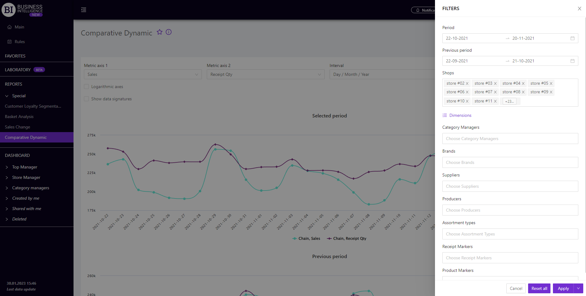
Filters
The selection of filters makes it possible to carry out the analysis within the specified conditions.
Filters button is placed on the right side above the report. Clicking on it opens a modal window with the following filters:
- Period
- Previous Period
- Stores
- Dimensions
- Category managers
- Brands
- Suppliers
- Producers
- Assortment types
- Receipt markers
- Product markers