Sections
Basket AnalysisQuadrant analysisProducers analysisStore cardProduct CardBrand salesPlanogram EfficiencyLost SalesSuppliers salesCategories salesCategory managersStores salesSales ChangeCategory CardMarkers comparisonProducts salesUnsaleable productsPrediction of OoS24-Hour AnalysisProducts movementEffectiveness of сashiersProducts for adjustmentPOS-terminal TrafficSales PlansNew SKUEffectiveness of Loyalty ProgramPromo CardStatistic of Loyalty ProgramCustomer Loyalty SegmentationLoyalty CardComparative DynamicsReceiptsStock MonitoringMainPromotion AnalysisRFM - analysisSTATISTIC OF LOYALTY PROGRAM
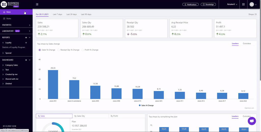
Reports on Datawiz BI service
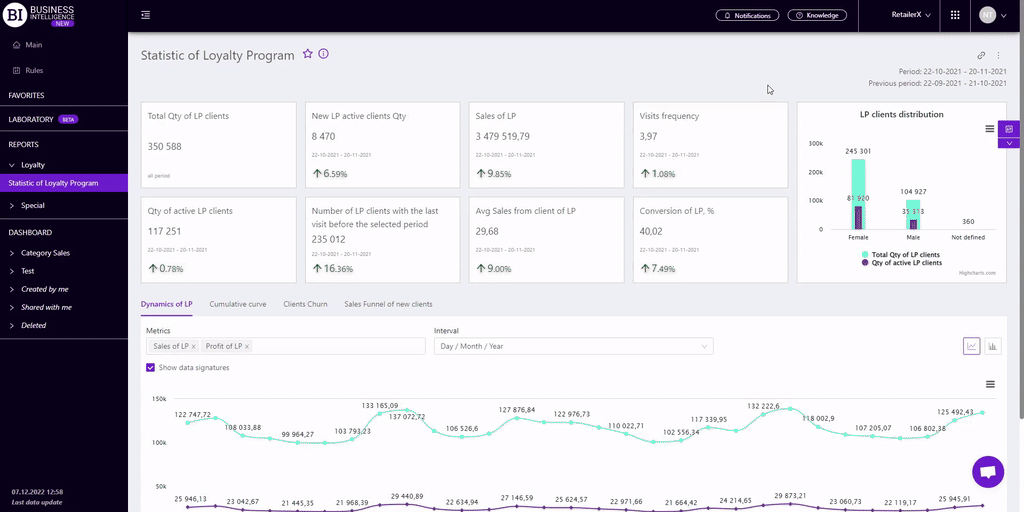
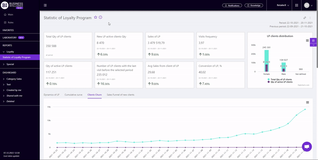
The "Statistic of Loyalty Program" report displays basic loyalty program data.
There are information cards with metrics at the top. They display basic information about the LP for the chosen period, namely:
- Total Qty of LP Clients (for the whole period)
- New LP Active Clients Qty
- Sales of LP
- Visits Frequency
- Qty of active LP Clients
- Number of LP clients with the last visit before the selected period
- Avg Sales from Client of LP
- Conversion of LP, %
Note! Each metric card (except for the Total Qty of LP Clients) contains:
- the actual value of the metric;
- the period for which it is generated;
- percentage change compared to the same previous period.
A green up arrow indicates an increase and a red down arrow indicates a decrease.
The card with the "Total Qty of LP Clients" metric - shows the total quantity of LP chain clients since the creation of the database and does not remain unchanged when applying any filters.
There is the "LP clients distribution" chart on the right. It allows to compare the receipt quantity from male and female clients.
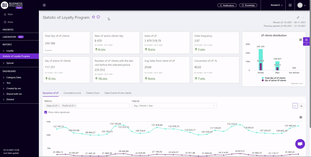
There are four tabs below: Dynamics of LP, Cumulative Curve, Clients Churn, Sales Funnel.
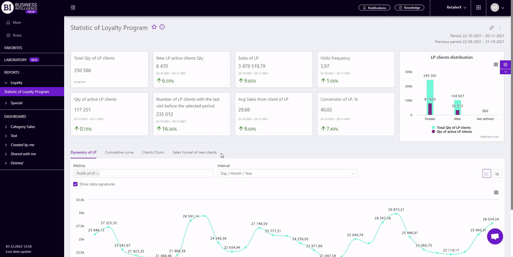
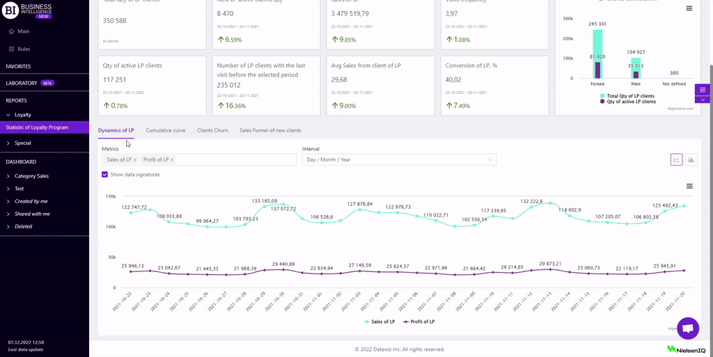
Dynamics of LP
The "Dynamics of LP" tab contains a visualization of the dynamics of LP sales over the chain. When creating visualization, you can choose:
- Metrics - the left field above the visualization which allows to choose the following metrics from the pop-up list:
To choose the necessary metric mark it with a flag. Up to 2 metrics can be displayed at once.
- Interval - the right field above the visualization which allows to set one of the proposed intervals:
- Day/Month/Year
- Month/Year
- Year
- Month
- Week
- Day of the Week
- Time
Mark the cell with the flag - Show Data Signatures (on the left above the visualization) to display the values of metrics.
Available visualization types: line graph, column graph.
Note! The Interval field is not available for a bar chart. However, the context menu (in the upper right corner of the visualisation) allows you to download the visualisation in png format and sort the visualisation by one of the indicators in ascending/descending order.
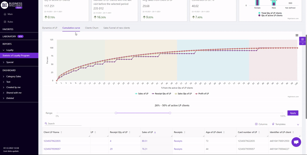
Cumulative Curve
The "Cumulative Curve" tab shows the graphical dependence of the cumulative sales distribution on the LP clients ("Pareto Curve").
The curve is built according to the following metrics: Sales of LP, Profit of LP, Receipt Qty of LP, Sales Qty of LP.
X axis "% from the LP Clients Qty" shows the accumulated percentage distribution by LP clients. It indicates how many LP clients generated a certain size and % of LP sales (Profit of LP, Receipts Qty of LP, Sales Qty of LP).
When hovering the cursor over a certain part of the curve, the corresponding values of the main metrics are highlighted.
Curve lines can be hidden by navigating under the visualization.
Clicking on a point in the graph opens a table with a list of TOP LP clients that generate a given percentage of the corresponding metric.
There is a range above the table which allows to set the minimum and maximum value of the generated metric in %.
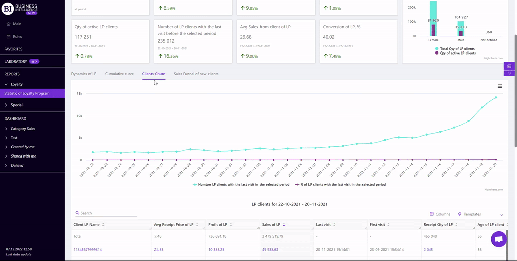
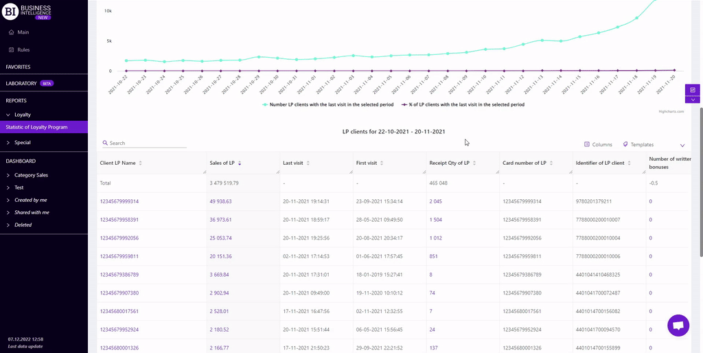
Clients Churn
The "Clients Churn" tab contains a visualization and a table with a list of clients who last visited the store in the chosen period.
The visualization shows how many clients came last every day for the chosen period and also shows the % of lost clients of the LP from the total quantity of active clients on that day.
There is a table below which shows the sales of LP clients who last visited the chain store in the chosen period.
Clicking on the point of the visualization on the "Number LP clients with the last visit in the selected period" metric filters the table and displays the data of the chosen group of LP clients for the corresponding day.
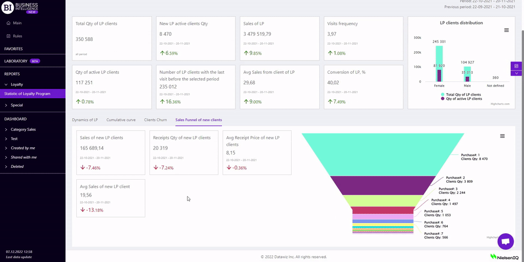
Sales Funnel
The "Sales Funnel" tab shows the distribution of clients by number of purchases. That is, it shows how many clients made the first purchase, how many of them stayed and made their next purchases.
The tab contains information cards with metrics for new LP clients for the chosen period, namely:
- Sales of new LP Clients
- Receipt Qty of new LP Clients
- Avg Receipt Price of new LP Clients
- Avg Sales of New LP Clients
There is the "Sales Funnel" visualization on the right. It displays client groups by purchase quantity.
Clicking on a single rendering block opens two tabs:
- Clients List - a table that displays data by new clients who have made the appropriate purchases for the chosen period.
- Client Purchases - a table containing the list of categories and products that have been received by the receipts of the relevant group of new LP clients.
Metrics
"Columns" button allows to choose the necessary metrics for generating a report:
- Sales of LP
- Profit of LP
- Receipt Qty of LP
- Avg Receipt Price of LP
- Last Visit
- First Visit
- Max SKU Qty in receipt
- Receipts
Note! Access to viewing metrics according to the user's role is determined by the administrator. Contact your administrator to expand the access.
Metrics highlighted in purple or red are clickable. Clicking on them opens a window with a flow chart of the chosen metric.
"Templates" button - saves the configured report columns as a template.
On the right above the table a context menu is opened where the user can select the following actions:
- "Lock the total row" - fixes the "Total" row in the top row of the table.
- "Save XLS" - saves table data to an xls-file.
To quickly find the necessary client, enter the first letters/symbols of the client name in the search field. The search works automatically, leaving all found matches in the table.
To reset the search results, click on the cross in the search field.
Filters
The selection of filters makes it possible to carry out the analysis within the specified conditions.
Filters button is placed on the right side above the report. Clicking on it opens a modal window with the following filters:
- Period
- Period for analysis
- Stores
- Categories
- Brands
- Interval
- Receipt markers
- Product markers
- LP Clients’ filter
- Metric for sampling